
What a charity or community organisation website needs
The pages, features and behind-the-scenes setup that help charities and community groups get people to join, donate, volunteer and attend.
By Daniyaal5 min read
Charity and community websites have a harder job than most. They speak to several very different groups at once: people who want to join or attend, supporters who might donate, volunteers, partners and funders. And they're usually kept up to date by a small team or by volunteers, around everything else they do.
I've built websites for Scout groups, educational charities, community services and national community organisations. These are the things that make the biggest difference.
Start with your audiences, not your pages
The most common problem I see is a website organised around the organisation's structure instead of around the people visiting it.
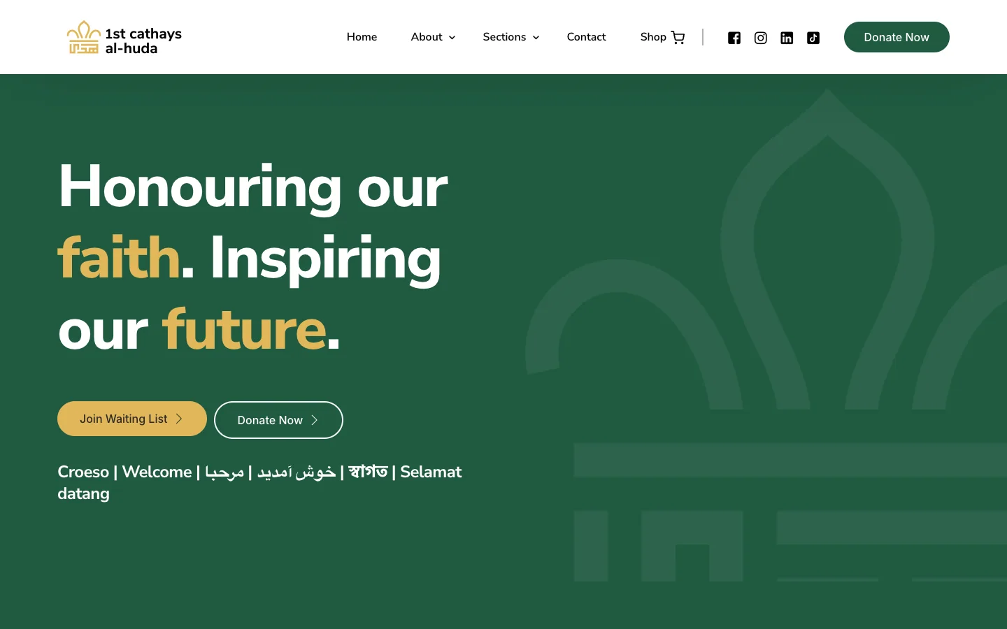
Before thinking about pages, list who comes to your website and what each of them wants to do. For 1st Cathays Al-Huda, a busy, volunteer-run Scout group in Cardiff, that meant clear routes for:
- families who want to join the waiting list;
- supporters who want to donate;
- volunteers who want to get involved;
- members buying from the group's shop.
Each route is easy to find from the homepage, so nobody has to dig through the site to work out where to go.

Make the main actions impossible to miss
Most visitors arrive wanting to do one thing. Make the most important actions visible on every page, usually in the header and again near the bottom of each page:
- Join (or register, or sign up to a waiting list)
- Donate
- Volunteer
- Find a class, event or service
- Contact us
Pick the two or three that matter most to you, and resist adding more. A header with eight buttons is as hard to use as one with none.
Make giving easy
If you take donations, the path from "I'd like to help" to "done" should be short:
- a clear donate button that goes straight to the form, not to a page about donating;
- suggested amounts with a sentence on what each one helps with, where you can say so truthfully;
- the option to give once or regularly;
- if you're a registered charity, a Gift Aid declaration, so you can claim an extra 25p from HMRC for every £1 eligible UK taxpayers give;
- an automatic thank-you email, so supporters know their gift arrived.

Help people find you in person
Many community organisations do their most important work face to face. The website's job is to get people through the door.
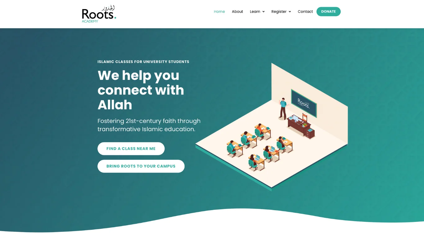
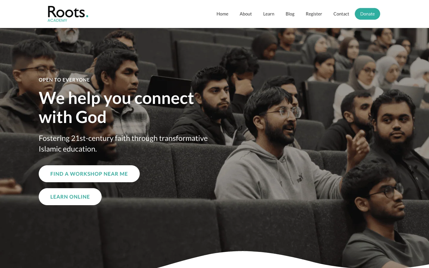
For Roots Academy, an educational charity, I built a map showing the cities and venues where classes are held, so people can quickly find an in-person class near them. On the academy's new website, the map stays in sync with its app: when a new class location is added, it appears on the website automatically, without anyone editing a page.
Even if you only have one venue, make the address, opening times, accessibility information and how to get there easy to find.
Build it for everyone
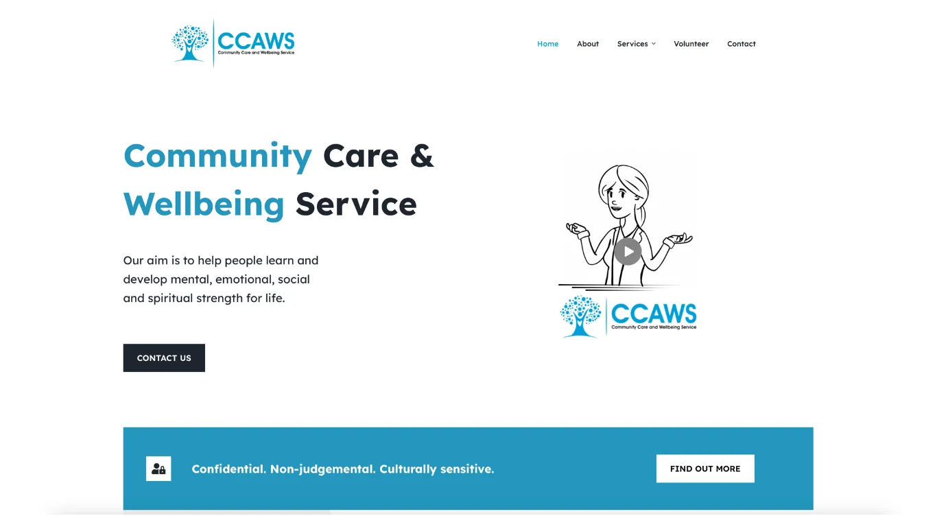
Your audience includes people of every age, on every kind of device, with different levels of confidence online. For CCAWS, a community care and wellbeing service, I kept the design clean and minimal, with a simple menu and dedicated sections for services, events and resources, so people can reach the right information quickly on a phone, tablet or computer.
A few habits that help everyone:
- write in plain language and keep paragraphs short;
- make sure text has strong contrast against its background;
- describe images with alt text for people using screen readers;
- make buttons and links large enough to tap easily;
- test the website on a phone, because that's how most people will see it first.
Keep it consistent with your brand
Trust matters when you're asking people for time or money. A website that looks and sounds like your printed materials, social media and events feels more established.
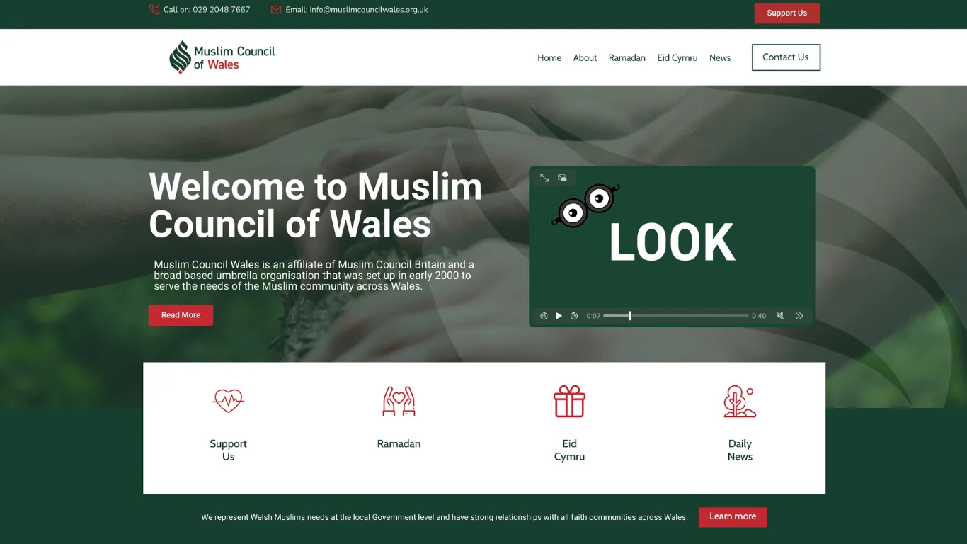
For the Muslim Council of Wales, the website had to follow established brand guidelines exactly, from colours and typography to overall feel. I worked closely with their branding team throughout, so the website and the brand feel like one organisation.
Make it easy for your team to update
A website is only useful if it stays current. Out-of-date events and old news quietly tell visitors the organisation isn't active.
Choose a setup your team can update themselves: adding events, news, class times and photos without needing a developer each time. Give each person the access they need, and agree who looks after which part of the site.
Get the trust and legal basics right
Small details reassure visitors that you're a real, well-run organisation:
- show your registered charity number (if you have one) in the footer;
- include a clear privacy policy, and only use cookie banners for cookies that actually need consent;
- if you work with children or vulnerable adults, make your safeguarding information easy to find;
- give people more than one way to contact you;
- keep the website secure and up to date.
When you need more than a website
As organisations grow, the website often needs to do more than share information:
- bookings: 1st Cathays Al-Huda hires out equipment and vehicles through a separate, branded booking platform built on my Booka system;
- online learning: Roots Academy runs courses through its own learning platform, Roots Essentials Online;
- memberships, events and payments, connected to the same website.
It's worth planning for this early, even if you build it later, so the pieces fit together.
A quick checklist
- Each audience has an obvious route from the homepage
- Your two or three main actions are visible on every page
- Donating takes as few steps as possible, with Gift Aid if you're eligible
- Locations, times and how to get there are easy to find
- The site is readable and easy to use on a phone
- It matches your brand
- Your team can update it without a developer
- Charity number, privacy policy and safeguarding information are in place
If you're planning a new website for a charity or community organisation, or your current one is hard to keep up to date, get in touch. I'm happy to talk it through.